As most Web developers already know, using @media queries in combination with %-based (or em-based) values in your CSS is the best way of presenting your Web pages optimally on a variety of output devices such as desktop displays, mobile phones, and tablets.
Responsive Web Sites
For those of you who don’t know what I’m talking about, check out these fine example sites. To see what I mean, click on a picture to load them into a browser window. Then slowly change the size of the browser and watch how these Web sites handle differences in screen size.
You’ll note that they dynamically change font and images sizes, and even completely change layouts, all based on the browser’s display size.
The point is that these sites look great all the way from a huge desktop screen down to the smallest smart phone display. That’s what we’re after.
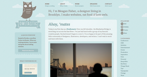
OWLTASTIC
Deren K

Boston Globe

About.com

Inconsistent @media Values
As I set out to define my CSS files, my simple @media queries weren’t always working. Unfortunately, I quickly realized that I couldn’t just use “@media max-device-width:320px” and other increasing pixel values to define the range of devices I was going to support.
Bottom line, the expected results from the @media queries were not consistent across the various devices. For example:
- While most devices report the “@media device-width” based on the current orientation of the device, the iPad for some reason always reports its width as 768px in both landscape and portrait orientations!
- While most devices report the “@media device-width” as the actual number of pixels that make up the width of the device, some devices report a value less than the actual number of pixels in order to present a larger view to the user. For example the iPad 3′s display is physically 1536 x 2048. However, it reports a value of 768px for the “@media device-width” value.
Determining Actual @media Values for a Device
In order to create @media queries that isolate the range of devices I want to support, I needed to learn the values devices actually report for the various @media queries.
I hoped (assumed) I’d just find some simple Web page that I could load on each of the devices I was targeting and it would tell me the device’s actual values.
Turns out I was very wrong!
After a lot of Googling around, not only does this very useful Web page not exist (at least I can’t find it), but JavaScript can’t directly access these values either! So I can’t easily write my own page as a solution.
Problem
As of this writing, there are currently no properties on the window or screen objects to access the values examined by the @media queries. In other words, I can’t just “alert(‘Device Width: ‘+screen.deviceWidth)” to display all of the @media values.
Turns out a few are available, but I can’t be 100% certain they’re the same as the @media queries
Clearly, I can “test” against a given @media value. For example, I can write window.matchMedia( “min-device-width:768px” ), and this will return true for all devices that are 768 pixels wide or larger.
However, I can’t easily report what the device’s actual pixel width is. For example, my desktop screen is currently 1600 pixels wide, but would also match this query. In some cases, I could use “other” older JavaScript-accessible properties, but I specifically want to know how the @media values are reported since this is how I’m going to code my CSS.
Solution
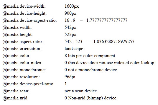
I have created a simple Web page that you can load into any browser on any device, and it will directly report the value of each of the device’s @media queries.
It does this by simply testing every value until a value reports true. For example, for determining the device’s “@media device-width” value, it tests every value from 0 to 4000, and in the case of my desktop stops once it reaches 1600.
Clearly, there is a distinct speed issue here …especially if I examine 15 or 20 properties. To speed things up, I’ve created a set of “likely’ values for each property. For example, when reporting on the “@media color” value, I pass in [8,10,12,16,24,32] as likely tests. If this list fails, then it will test every value from 0 to 4000. In most cases, the likely values are used. In a few cases — usually when a browser doesn’t support a given @media query — it’ll take a bit longer …but no more than 5 seconds or so.
It’s a work-in-progress. As I get to using it on more devices, I’ll refine, add, update as necessary. But for now, this should do quite well.
Hope it helps you too.
<link rel="stylesheet" media="only screen                          and (max-width :  480px)" href="css/layouts/tiny.css" />
<link rel="stylesheet" media="only screen and (min-width :  481px) and (max-width :  800px)" href="css/layouts/small.css" />
<link rel="stylesheet" media="only screen and (min-width :  801px) and (max-width : 1280px)" href="css/layouts/medium.css" />
<link rel="stylesheet" media="only screen and (min-width : 1281px)                         " href="css/layouts/large.css" />
See your device’s @media values now.
Here’s what the output looks like