
Goal
Download and apply only the styles I need.
Media queries are awesome! They allow me to target CSS rules to very specific solutions. If you’ve been reading my posts here, you’ll realize what my ultimate goal is: to produce a single product that runs properly on all targeted devices (desktop browsers, tablets, and smart phones). And my solution must be fast (light-weight) since mobile devices are still a bit under-powered.
@media queries are commonly part of (within) a CSS file. For example, in the code below, a width of 743 pixels is assigned to the “Hello World” div for only “screen” devices with a width of between 801 and 1280 pixels.
@media only screen
and (min-width :  801px)
and (max-width : 1280px)
{
   #helloWorld
   {
      width: 743px;
   }
}
Intriguingly, @media queries can also be part of a <link> command. This is the example we often see when researching how to use @media queries.
<link rel="stylesheet" type="text/css" media="screen" href="sans-serif.css">
<link rel="stylesheet" type="text/css" media="print" href="serif.css">
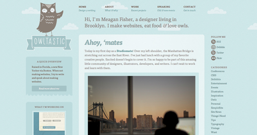
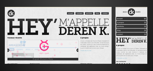
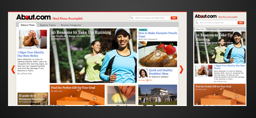
This common example suggests that I should segregate my styles into CSS files intended for specific uses. In my personal project, this is exactly what I’ve done. Basically, I’ve set up 4 style sheets each designated for a specific range of screen widths.
<link rel="stylesheet" media="only screen                          and (max-width :  480px)" href="css/layouts/tiny.css" />
<link rel="stylesheet" media="only screen and (min-width :  481px) and (max-width :  800px)" href="css/layouts/small.css" />
<link rel="stylesheet" media="only screen and (min-width :  801px) and (max-width : 1280px)" href="css/layouts/medium.css" />
<link rel="stylesheet" media="only screen and (min-width : 1281px)                         " href="css/layouts/large.css" />
Problem
Problem is, this code still downloads ALL of the listed CSS files . . . even though I might only need the “tiny.css” on a smaller given smart phone.
Clearly, @media queries are not a complete solution since they still fetch all of the CSS files even if I know ahead of time that these CSS files/rules will never be used.
I want a solution that downloads and applies only the required styles for the given situation.
Solution
The first question is whether to use the @media queries inside the CSS or in the <link> commands. The answer is BOTH.
- You’ll want them in the <link> commands in order to prevent the fetching of a given CSS file. More on this later…
- You’ll also want them inside the CSS files in the event the client downloads multiple CSS files and needs to switch between them. For example, switching from portrait to landscape orientations might trigger switching from the tiny.css to the small.css rules.
Conditionally fetching CSS files
I’ve written a very small snippet of JavaScript that uses the @media queries in the <link> command to only download the CSS files that are relevant to the current device and situation.
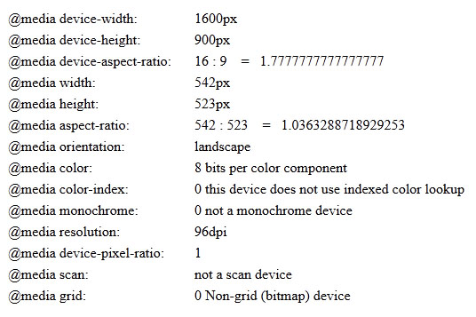
This example uses the “width” @media query instead of the “device-width” for the following reasons:
- width takes into consideration the “pixel ratio”. For example, a Google Nexus 7 has a device-width of 1280 x 800. However, it’s pixel-ratio is 1.33 which means that it reports a CSS resolution of 966 x 603 . . . the resolution the vendor believes is optimal for this device.
- width changes based on orientation (orientation is just another resolution!). The iPad reports a device width of 768 in both portrait and landscape modes. The @media width value, however, properly changes as orientation is changed.
- width affects desktop displays as the browser is resized. This allows a Web UI on a browser to relayout as necessary based on the current browser size. Checking @media device-width always reports the same number.
- it’s much easier to base a series of @media statements on width since it doesn’t need to deal with all of the exceptions in dealing with device-width.
This code executes right when the file is loaded, and runs again as needed every time the device’s orientation changes or the window is resized.
NOTE: if the JavaScript method window.matchMedia() is not supported, this code then automatically allows and fetches the specified CSS files. In other words, it’s a fail-safe scenario when the conditional download mechanism is not available.
This code dynamically fetches only those files that are needed for the current situation …and downloads additional CSS files as needs change during execution.
Hope this helps!
   <script type="text/javascript" language="javascript">
      var head  = document.getElementsByTagName('head')[0];
      var links = document.getElementsByTagName('link');

      //Prevent adding the same <link> more than once
      function hasLink ( cssURL )
      {
         for ( x = 0; x < links.length; x++ )
         {
            var href = links[x].getAttribute ( "href" );
            if ( (typeof(href) != 'undefined') && (href === cssURL) )
               return true;
         }
         return false;
      }

      //Include CSS if Media Query matches or @media examination is not supported
      function includeCSS ( mediaQuery, cssURL )
      {
         var deviceQuery = window.matchMedia( mediaQuery );
         if ( (deviceQuery.matches == true) || (typeof(window.matchMedia) === 'undefined') )
         {
            if ( hasLink ( cssURL ) == false )
            {
               var link = document.createElement('link');
                   link.href = cssURL;
                   link.rel  = 'stylesheet';
                   link.type = 'text/css';
               head.appendChild(link);
            }
         }
      }

      function evaluateLayoutCSS()
      {
         includeCSS ( "only screen                          and (max-width :  480px)", "css/layouts/tiny.css"  );
         includeCSS ( "only screen and (min-width :  481px) and (max-width :  800px)", "css/layouts/small.css" );
         includeCSS ( "only screen and (min-width :  801px) and (max-width : 1280px)", "css/layouts/medium.css");
         includeCSS ( "only screen and (min-width : 1281px)                         ", "css/layouts/large.css" );
      }
      evaluateLayoutCSS(); //Run early at least once

      //Register events to recalculate the media queries on orientation and size changes
      window.onorientationchange = function() { evaluateLayoutCSS() };
      window.onresize            = function() { evaluateLayoutCSS() };
   </script>


